I was asked to design a church directory cover.
On my quest to design an awesome directory cover, I settled upon an art deco inspired style. It's classy, evokes that sophisticated, upon the edge of greatness feel, and I like it. Here is the final image.
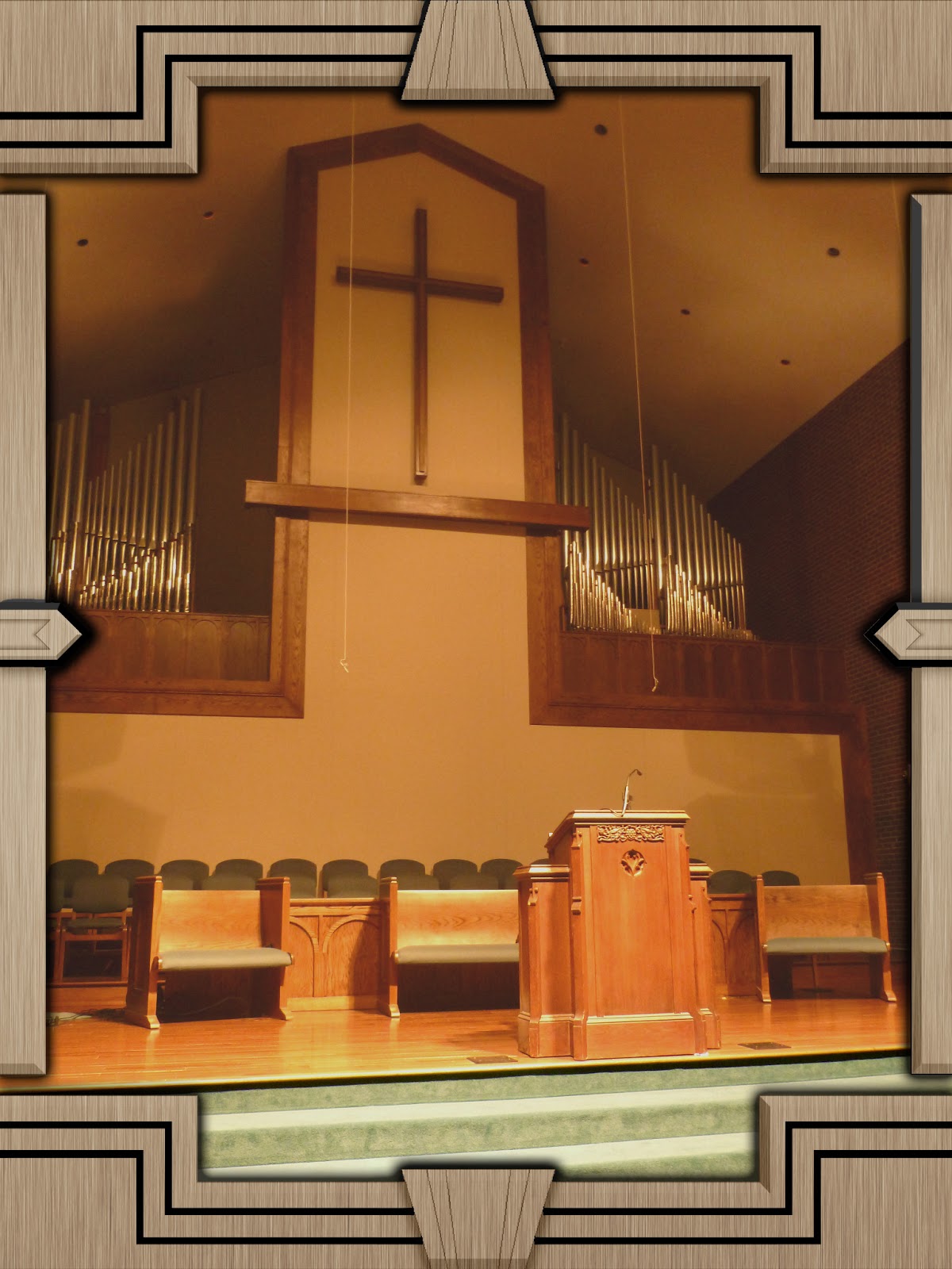
I also went with an interior image, bucking the trend of a steeple image on the front. I did this for a couple of reasons- a steeple is typical and what you would expect. Second, the church had just renovated the sanctuary, so it made sense to show it off.
 |
| The finished cover, less text. |
I had originally pictured an Irish rope design around the border with an ornate gold cross, but that idea thankfully evolved.
A few themes inspired by the Empire State Building, because that building is classic art deco:
 |
| Simplicity. |
 |
| The Empire State building influence is easily recognizable. |
 |
| This one is a bit too busy. |
I culled those ideas into something simpler, so the border would not overtake the image. You can see the influences of the sketches above in the border below.
I still felt the border was too much and scaled it back farther. At this point, it started actually looking good, and I transitioned to the final image.


No comments:
Post a Comment