I've done very little color grading with my previous videos, but that is going to change after the great results of my recent project.
Here is an example of color grading, both before and after shots that I took as I share what I've learned from mainly trial and error and what little I remember of color theory.
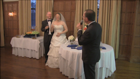 |
| Original Image |
Images direct from your camera are going to look flat. Setting your white balance so that blacks are black and whites are white will provide your image with more contrast and a better aesthetic.
 |
| Original Image |
 |
| White balance/Contrast |
If you push the highlights to orange it's going to make skin tones pop. Treat the controls like a manual focus, push it too far, too little, and then back to find that sweet spot. The adjusted white balance looks a bit to sterile, but that will change in the next step.
If you pull the shadows down to a teal, this is going to further emphasize flesh tones and make the people in your video look alive.
 |
| Original Image |
 |
| White balance/Contrast |
|
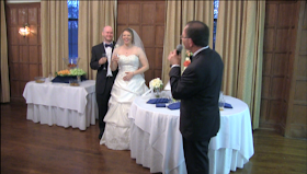 |
| Highlights/Shadows |
Blue and orange are contrasting colors which is why we focus on these colors for shadows and highlights.
 |
| Original Image |
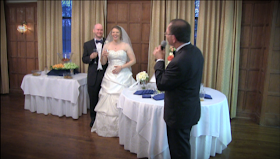 |
| Final Image |
These simple adjustments will give your final image a cinematic feel. Of course, you may want your shadows to have an olive green hue for a military film, or you may want to shift colors from warm to cool depending on the look desired, but this will start you in the right direction.
These tips work for any image, still or moving.


No comments:
Post a Comment