I've always found the idea of drawing a cartoon in photoshop a bit daunting. I've done a couple of quick sketches and wasn't happy with the results. I decided to try again. I was happy with this result. I'll walk you through what I did and why.
 |
| Just your typical UFO beaming up a hapless individual. |
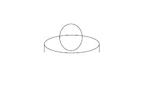
I started sketching shapes to figure out the composition. I knew I wanted a traditional flying saucer UFO.
 |
| All things start with simple shapes. |
 |
| It looks like a UFO, and it even has a death ray. |
 |
| A crude background |
This is where I got with my sketching, which ended up being the composition I used. From this point I redrew everything.
The pen tool creates shapes which can be filled or outlined. It's a great tool that I avoided for years due to confusion.
I used the pen tool to outline half of the UFO. I applied a fill path by right clicking and then copied the layer, mirrored it and then merged it with the layer below.
I then duplicated the UFO shape to separate the dome and undercut from the saucer. With the dome, I deleted the saucer, and I just moved the undercut down as the saucer will hide the rest of the shape when the undercut layer is moved below the saucer layer.
When you copy the main shape to create the sub shapes, don't paint bucket colors, you will lose the crisp edges from the pen tool. Use image adjustments like brightness/contrast and color balance.
When you use an adjustment to modify colors to preserve the crisp edges, isolate the color adjustment layer and shape layer and merge visible to combine the layers. An adjustment layer affects all layers below it, merging them locks the adjustment to just that layer.
For shadows and highlights, create a new layer and set opacity to 15%, then use black and white brushes to add highlights and shadows. If you control click the saucer layer, it will select just the saucer so your highlights don't bleed into the dome or undercut. You can set the eraser to half or quarter opacity to tone down blacks. Do this for the dome, saucer, and undercut.
A drop shadow was added to the undercut to give the image depth and separate the saucer from the background.
The gradient tool was used on a new layer, with the saucer shape selected, to give the saucer (and only the saucer) a curved look, and a satin layer effect was applied to give it a metal appearance.
I experimented with shading to provide a metal look and ultimately decided on the satin layer style.
Panel lines were added to the saucer. I used the pen took, drew lines for one half of the saucer, applied a stroke path,then copy and mirrored the layer before merging it down.
A bevel and outer glow effect were applied to the lights on the saucer, which are on their own layer.
The tractor beam layer's opacity was lowered and an outer glow was applied. The person shape is actually on the layer on top of the beam layer with a lowered opacity. The person started out as a stick figure, adding detail like knee and elbow joints make the person look more realistic
A new layer was created beneath the beam layer and an ellipse shape was created. It was then resized to fit the beam width.
Another layer was created, go to filter>add noise, then add a motion blur filter in the direction of the beam.
A diamond gradient (gradient tool) was added to one side to provide a setting/rising sun look.
A linear gradient from the effects was added for the gradient across the top of the image.
The tree layer was a google search image modified and copied to provide the desired shape.
To create stars, make a new layer, filter>noise, gaussian blur by 3 pixels, then apply a level adjustment, screen layer blending. This adjustment will brighten some of the 'stars' and knock down the darker noise areas to provide a convincing night sky.
These are the steps I followed to create the picture. If you have any questions, post a comment, let me see your creations, and if you liked what you read, don't forget to subscribe.


No comments:
Post a Comment